Richie’s
Brand Strategy / Visual Identity / Voice and Tone
Rebranding from the roots: Selling chicken, and serving love.
“The opportunity.”
The Opportunity.
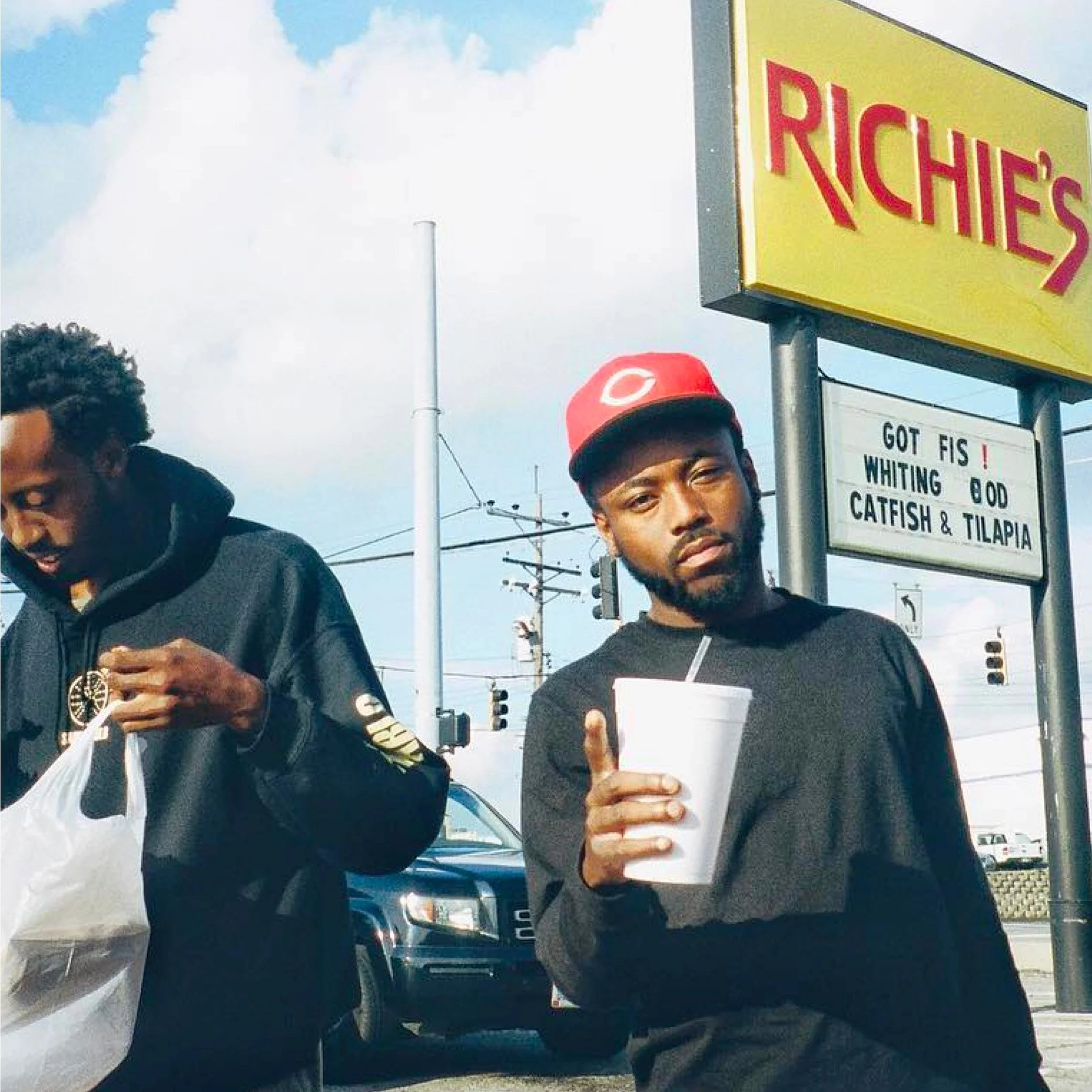
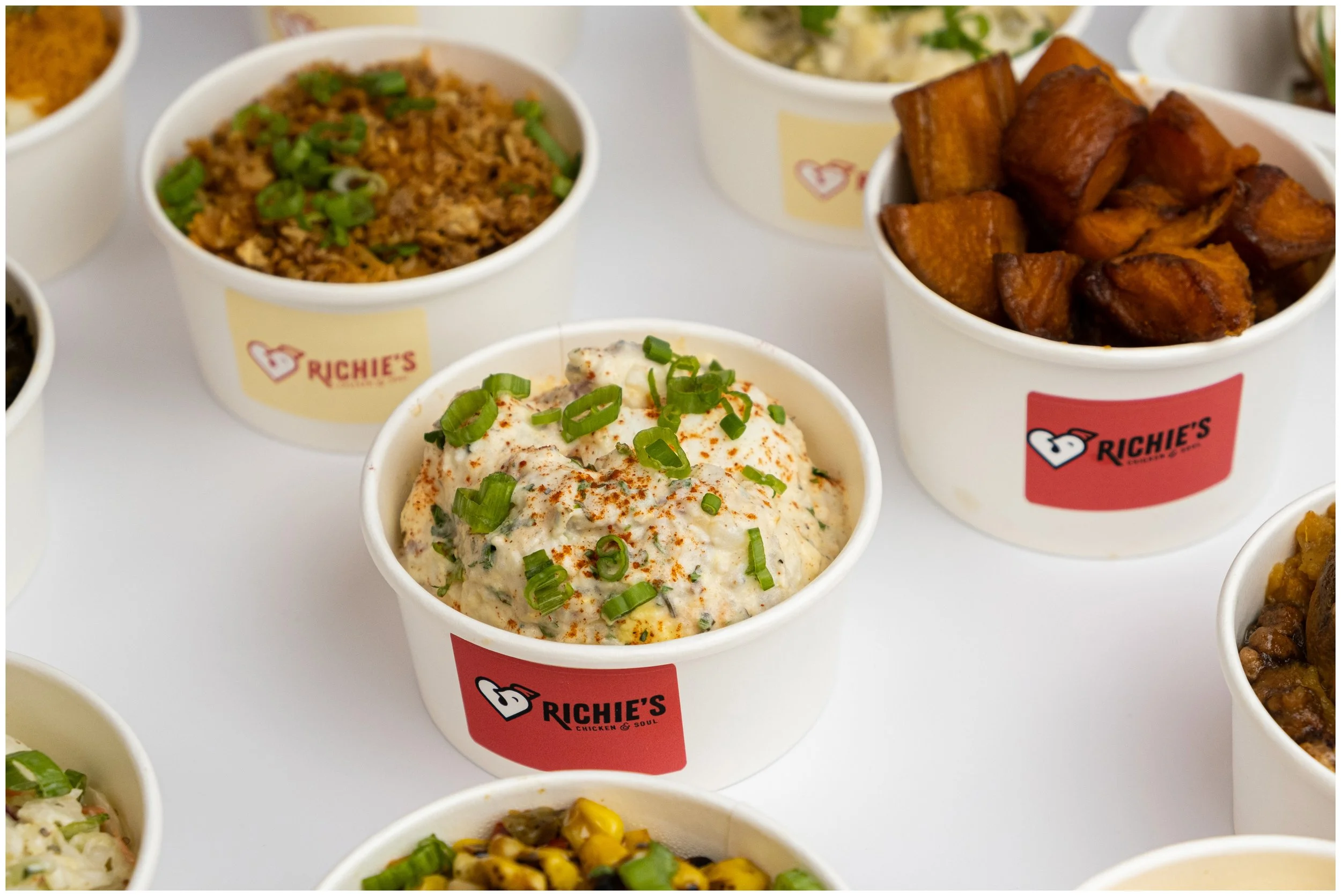
Richie’s is a Cincinnati legend, beloved for its classic crispy fried chicken, soul food sides, and irresistibly warm service.
To grow the company to the next level, the brand had to grow too. TCE partnered with Richie’s to translate the fun, familial, culture at Richie’s to an equally loving, warm, and inviting brand identity.
True to our roots.
For a brand loved since 1986, We needed effectively cue evolution without unraveling the brand equity built over decades.
Through creation of a precise persona, we emerged with a voice that was soulful, not Southern; sharp, not sassy; colorful, not corny.
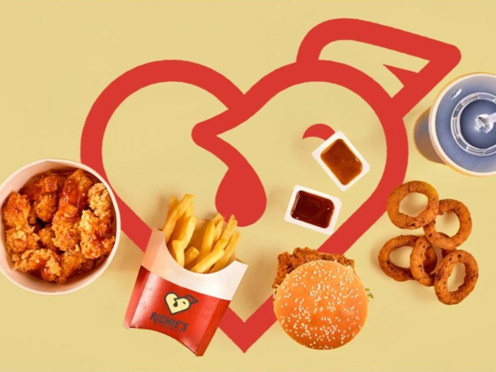
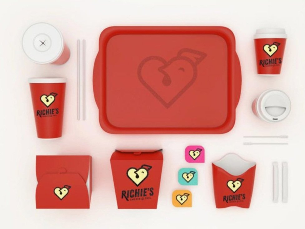
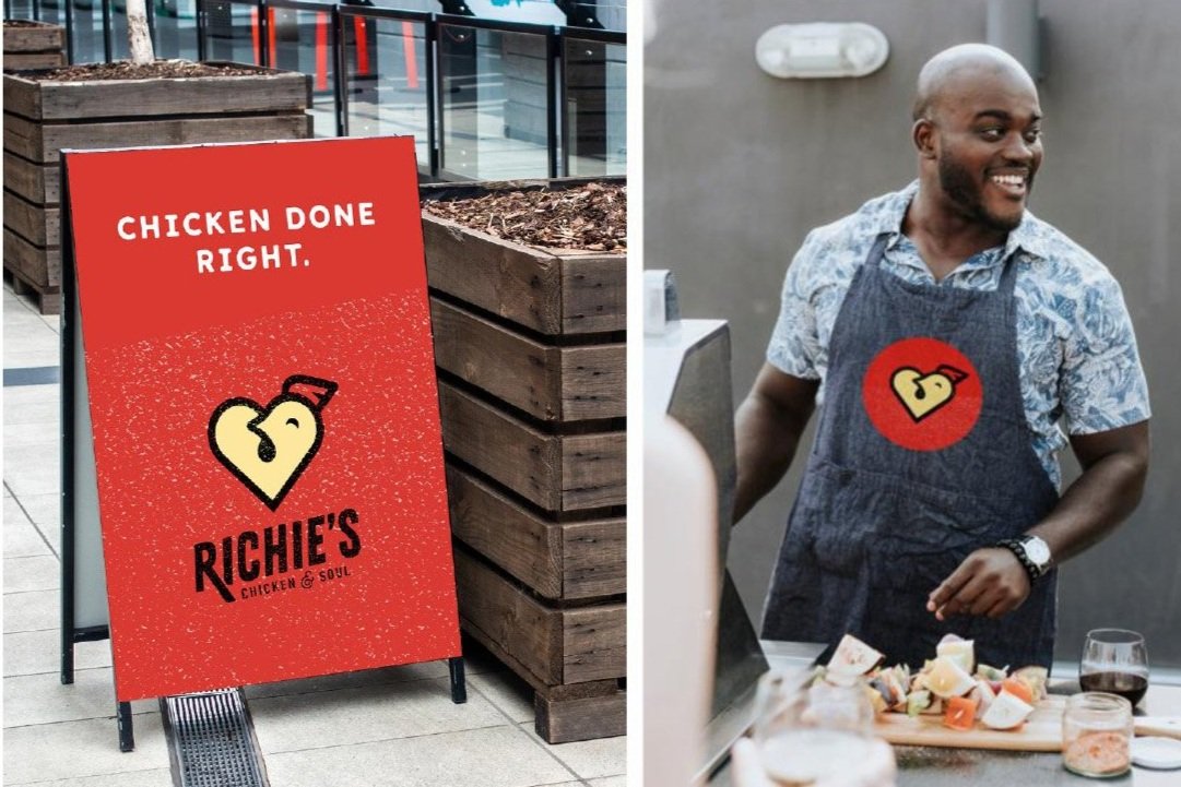
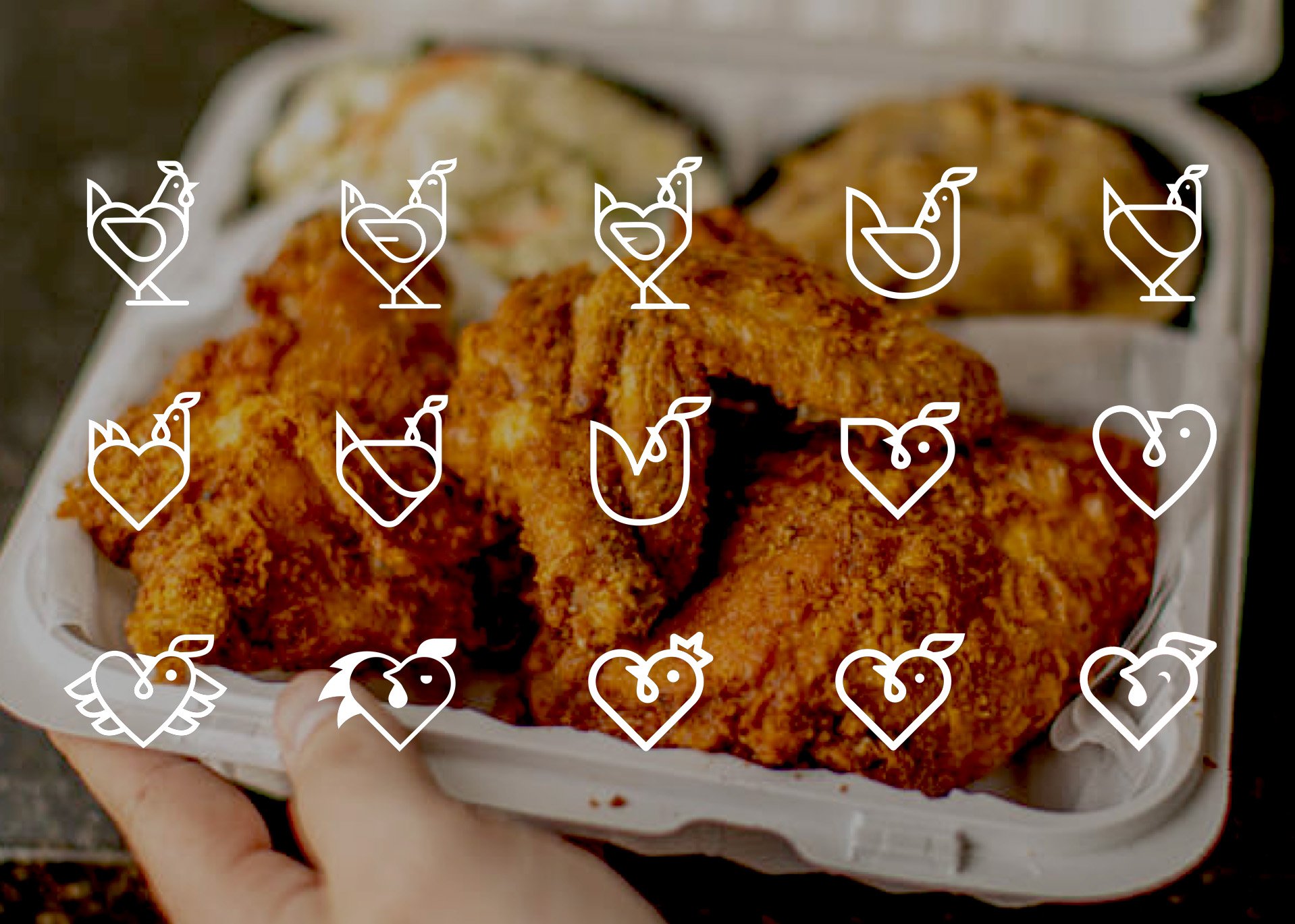
The updated logo honors Richie’s heritage, while the brand icon unifies Richie’s love of chicken with their love of community,
“Richies became Richies Chicken & Soul”
“Richie’s” became “Richie’s Chicken & Soul” — communicating to loyal guests and new visitors that our cult-favorite chicken comes first.
Equally friendly, inviting, and hip (check out the fade on his comb), the icon marries the soulfulness of Richie’s service with that of it’s chicken, creating a truly original identity for the next generations.

“ The results.”
The proof is in the chicken.
Equally friendly, inviting, and hip (check out the fade on his comb), the chicken icon marries the soulfulness of the Richie’s brand experience and the core product, creating a truly original identity that will last for generations.